Trending Upward: Our 2024 Color of the Year
Trending Upward: Our 2024 Color of the Year
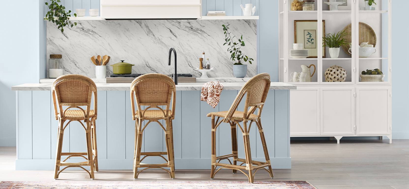
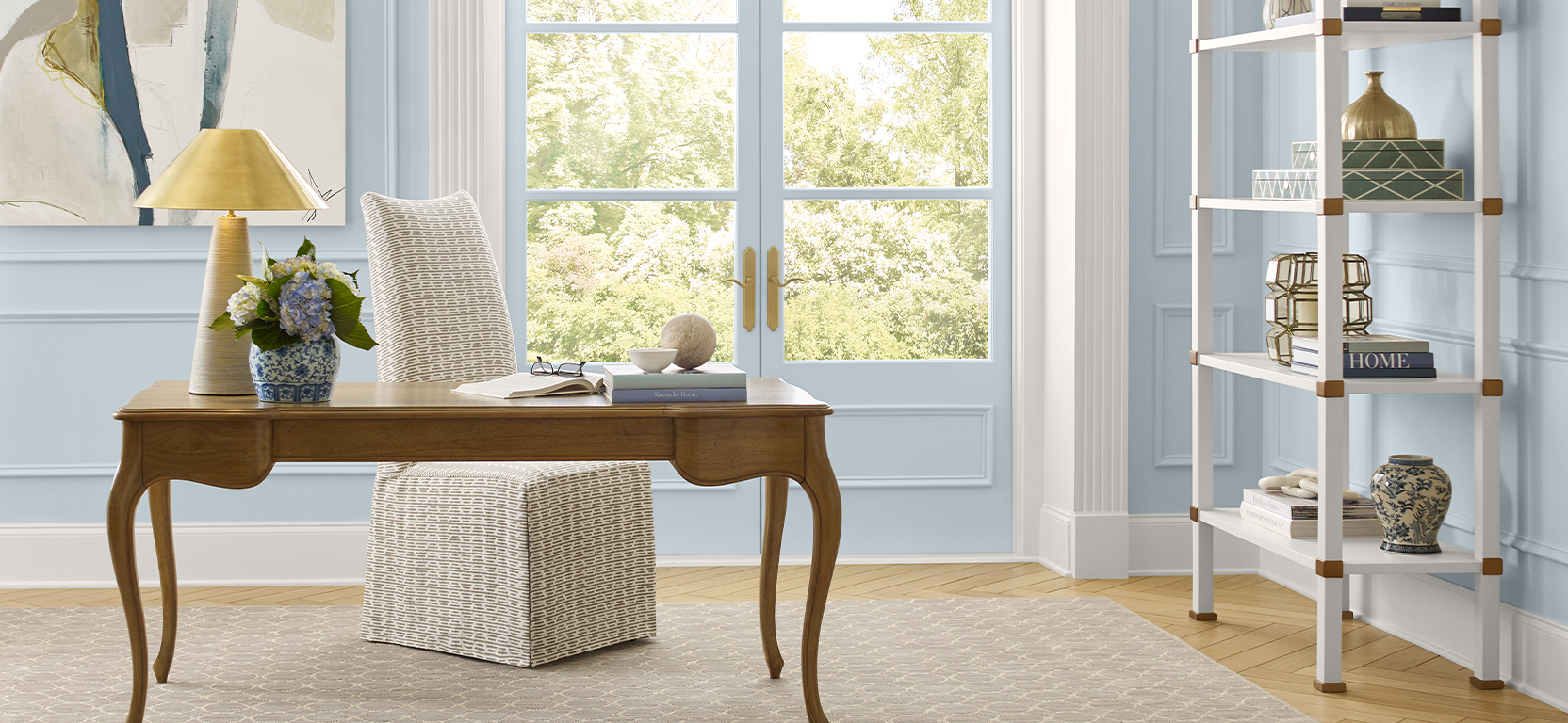
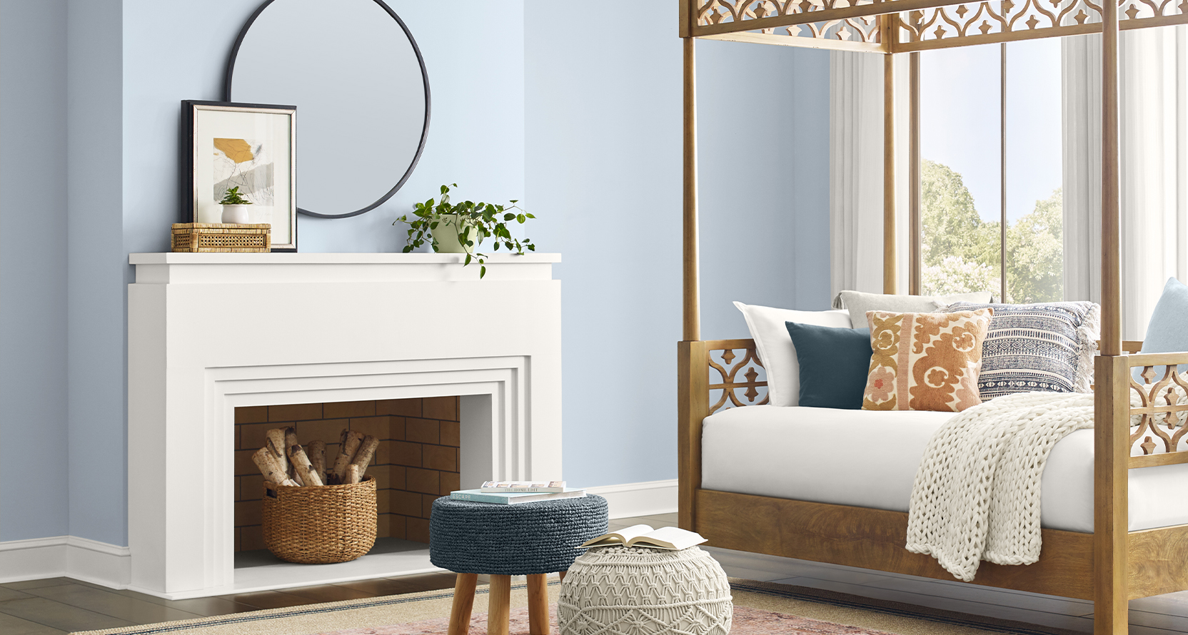
Each year, our color forecast team selects just one hue to tell the story of the cultural moment we’re experiencing. For our 2024 Color of the Year, we’re swept up in the clarity and calm of Upward SW 6239 (224-C1), a tranquil and uplifting blue-gray that encourages boundless creativity. This color of classic comfort speaks to a desire for personal progress and peace—an outlook and effort that allows us, individually and together, to move up and rise above—ever ascending.
Sue Wadden, Director of Color Marketing at Sherwin-Williams, tells us more about how this peaceful hue falls perfectly into place within the world of design and color trends.
STIR: Tell us the process for choosing Color of the Year.
Sue Wadden: You know that moment in a project when everything falls into place? The furnishings are in place, the lighting has been fine-tuned, and the color and finishes on the walls are bringing everything together. Your sense of accomplishment is sky high. I get the same feeling every year when we release the Sherwin-Williams Color of the Year.
Our color team spends a full year researching and gathering inspiration, which culminates in February when we all convene to put our forecast together. It’s three great days of idea swapping and color discussion (and, yes, coffee consumption), and we walk out of the room proud to have identified a color direction we can’t wait to share with the world.
It’s amazing how the enormous amount of information we gather finds its way into selecting one signature hue from a palette of thousands. That is the basic methodology for selecting our annual Color of the Year.
STIR: How was Upward finally selected?
Sue: We’re seeing a captivating shift toward warmer colors since 2020, signaling a departure from the cooler grays that have graced our interiors from 2008 to 2019. As designers, we understand that the essence of good color theory lies in striking the perfect balance. That’s where the beauty of icy blues comes into play—they act as an exquisite counterbalance, ensuring all the warmth in our palettes is in harmonious equilibrium.
I can’t help but notice the evolution of white as well—it still boasts its characteristic light and chalky allure, but now, with a hint of added saturation from a delicate trace of blue. It’s these subtle nuances that elevate the color game and infuse our spaces with timeless elegance.
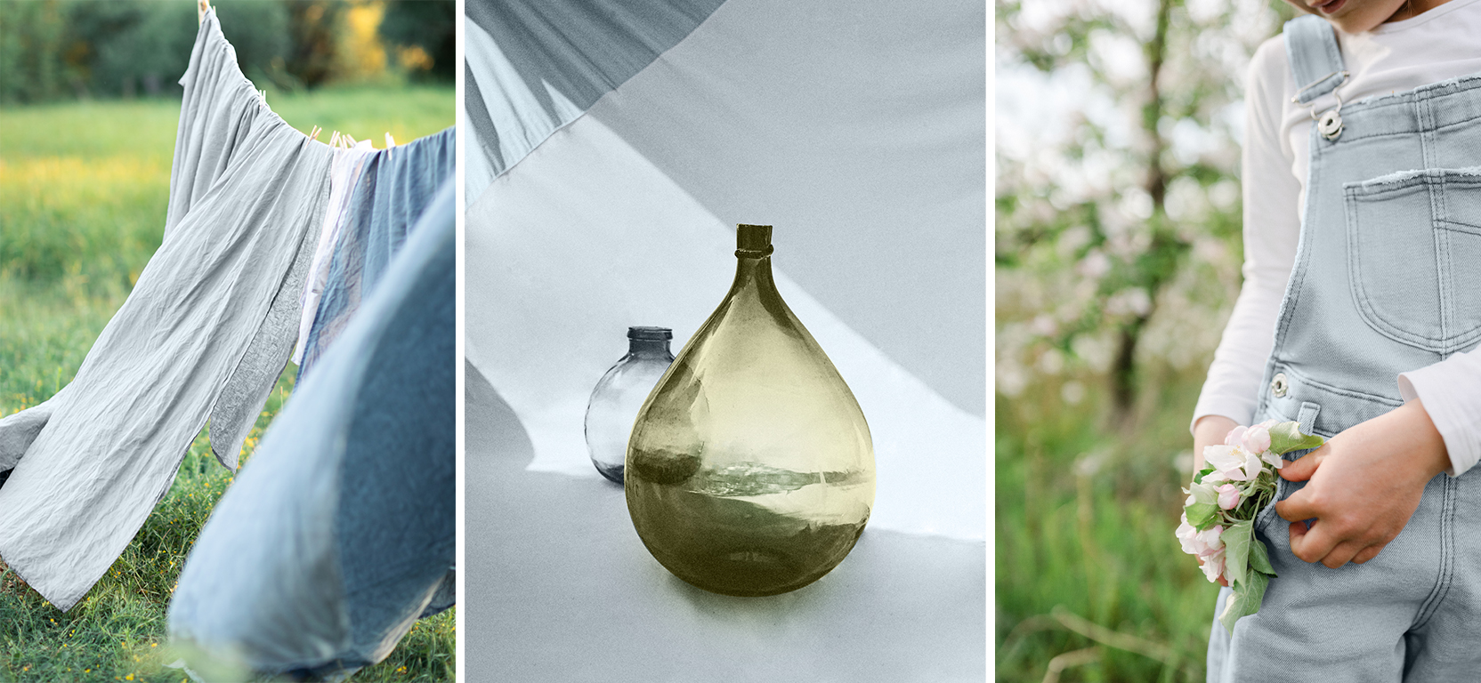
Although fashion isn’t always the main influencer for us, it does serve as a wellspring of inspiration, and I’ve been intrigued by the resurgence of super-light, almost stonewashed denim-like shades. This throwback style is rapidly gaining popularity, a sure sign that icy blue is making its triumphant comeback in the design scene.
STIR: What does Upward mean to you?
Sue: Upward is the ethereal dance of ambition and dreams, an ascent toward the limitless skies of possibility. It’s the daring leap that transcends boundaries, the intrepid flight that defies gravity’s constraints. Upward is the pulse of inspiration, the cosmic tug that urges us to reach higher and embrace the uncharted realms of our imagination. Upward is the ever-ascending spiral, propelling us to soar beyond the stars and write our stories among the constellations of greatness.
As we play with color, it’s essential to consider their interactions thoughtfully. Warmed-up blues might lead to hues that appear muddled and lackluster, which is why preserving the crisp edge and magnetic allure of cool blues is vital. These subtle nuances create spaces that are timeless and inspired. We’re excited to share this beautiful color and craft interiors that exude harmony and evoke a sense of enchantment.

STIR: How have hues in this color family been changing in recent years?
Sue: Since 2020, the blue color family has held significance, featuring shades ranging from blue-green to navy. Blue, representing change, commanded attention in 2020 with the designation of Naval SW 6244 (253-C6) as the Color of the Year. Looking ahead, the blue color family evolves into a softer and more muted iteration in 2024. While the range of hues may be narrower, the selected colors such as teal, airy blue, and indigo carry substantial meaning and exert a significant impact on design.
STIR: We’ve talked a lot about how blues and greens are defining the decade. What does that mean, and how does Upward fit into that narrative?
Sue: From the calming and flexible nature of green to the symbolic and ever-evolving constancy of blue, these colors continue to captivate and inspire, offering a wealth of creative possibilities. These elemental hues will draw inspiration from natural elements such as water, vegetation, and air, symbolizing transformation and the ever-evolving nature of our society.
The blue-and-green color group finds transitional harmony within a world of like colors and resonates beautifully with both cool and warm coordinates. The blues of the moment impart a bit more dustiness or depth, and greens dwell in a widely diverse range of hues and values.
STIR: In what settings and styles do you expect Upward to shine? How do you see it coming to life aesthetically for designers?
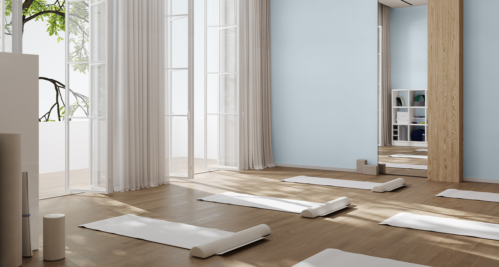
Sue: Used as an accent or all over, in classic coastal or casual Nordic styles, the airy, misty-hued beauty dwells where the fairest-weather blue finds just a hint of silver lining. Additionally, the commercial appeal of pale blue hues resonates widely, manifesting in furniture, lighting, textiles, and accessories in ranges that seamlessly blend aesthetics and functionality. I can see this color used everywhere!
Use the transitional blue of Upward SW 6239 (224-C1) to inspire meditative spaces of limitless possibility and absolute peace in both residential and commercial settings. To get started, order your exclusive Color of the Year sample kit, featuring Upward and its harmonious coordinating colors, complimentary with your PRO+ account .


