Anthology: The Evolving Colors of Colormix ®
Anthology: The Evolving Colors of Colormix®
Each year, the key colors unveiled with our Colormix® Forecast act as crucial reference points, establishing the color-trend universe from which our Color of the Year and Colors of the Month are selected. Each hue and color group has meaning, all of them closely interconnected, and together they awaken modern aesthetics and become a resource to professionals who choose and use them to thoughtfully design the world we live in.
For 2024, we’re delivering something different for your designer toolkit. We call it Anthology: Volume One, a biennial color trend report organized by color family. This essential color reference will alternate each year with the style and trend storytelling you’ve come to know and love.
With the help of this year’s designer-exclusive lookbook or through color samples, you can discover—and decide for yourself—what the future holds for this volume’s four featured groups: blues and greens, reds and purples, deeps and darks, and delicate tints. But first, let’s explore how each of these groups have evolved in recent years.
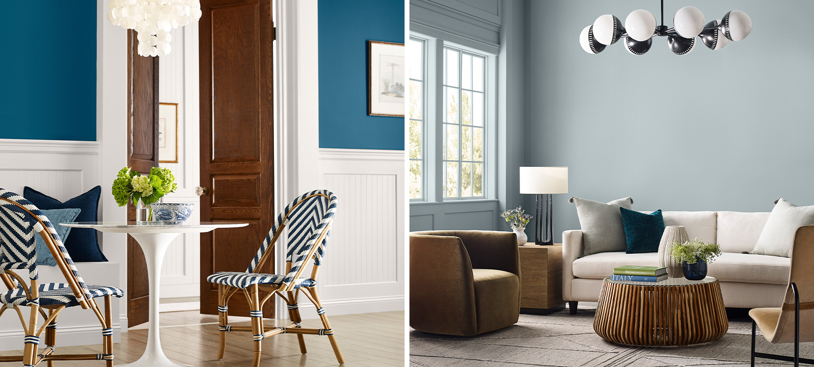
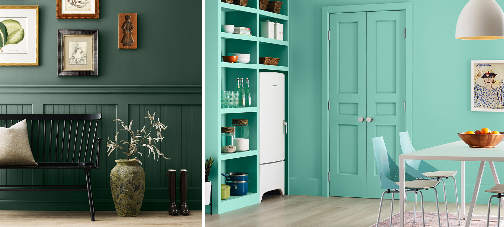
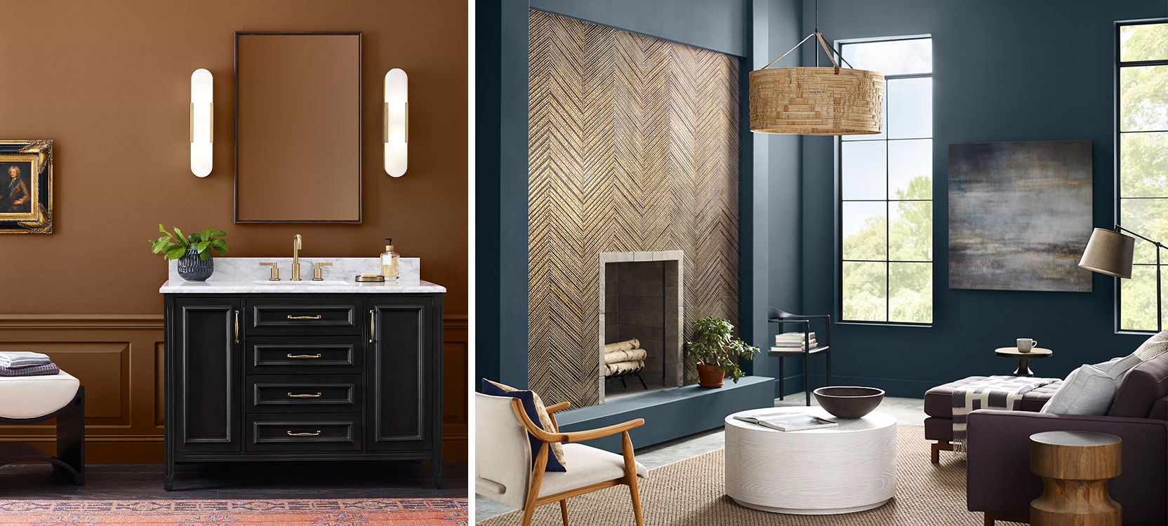
Blues and Greens: A Story of Synergy

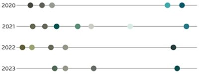
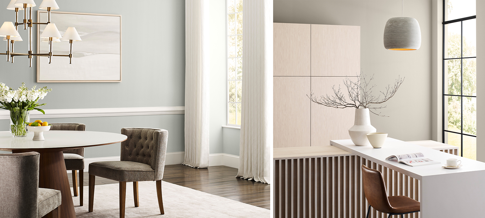
Our Colormix® forecasts have predicted the rising popularity and significance of hues ranging from pale green to teal to deep navy—and many shades in between—for the past several years. The cycle resumes with a sometimes softening, and other times strengthening, evolution for the future of this color family, representing a maturation of nature-inspired colors in design. Wellness-boosting blues in smoky or more saturated tones bring calm and mental clarity, greens continue to be favored in a diverse range of values, and blue and green have begun to converge as we examine our relationship to the natural world.
“For 2024 we’re predicting an update to the traditional pairings of blue and green with neutrals for a functional and clean or more artisanal and pigmented aesthetic,” says Sue Wadden, Director of Color Marketing at Sherwin-Williams. “This group, especially the tonal variations of green, will be around for the rest of the decade and is potentially the defining color family of the 2020s.”
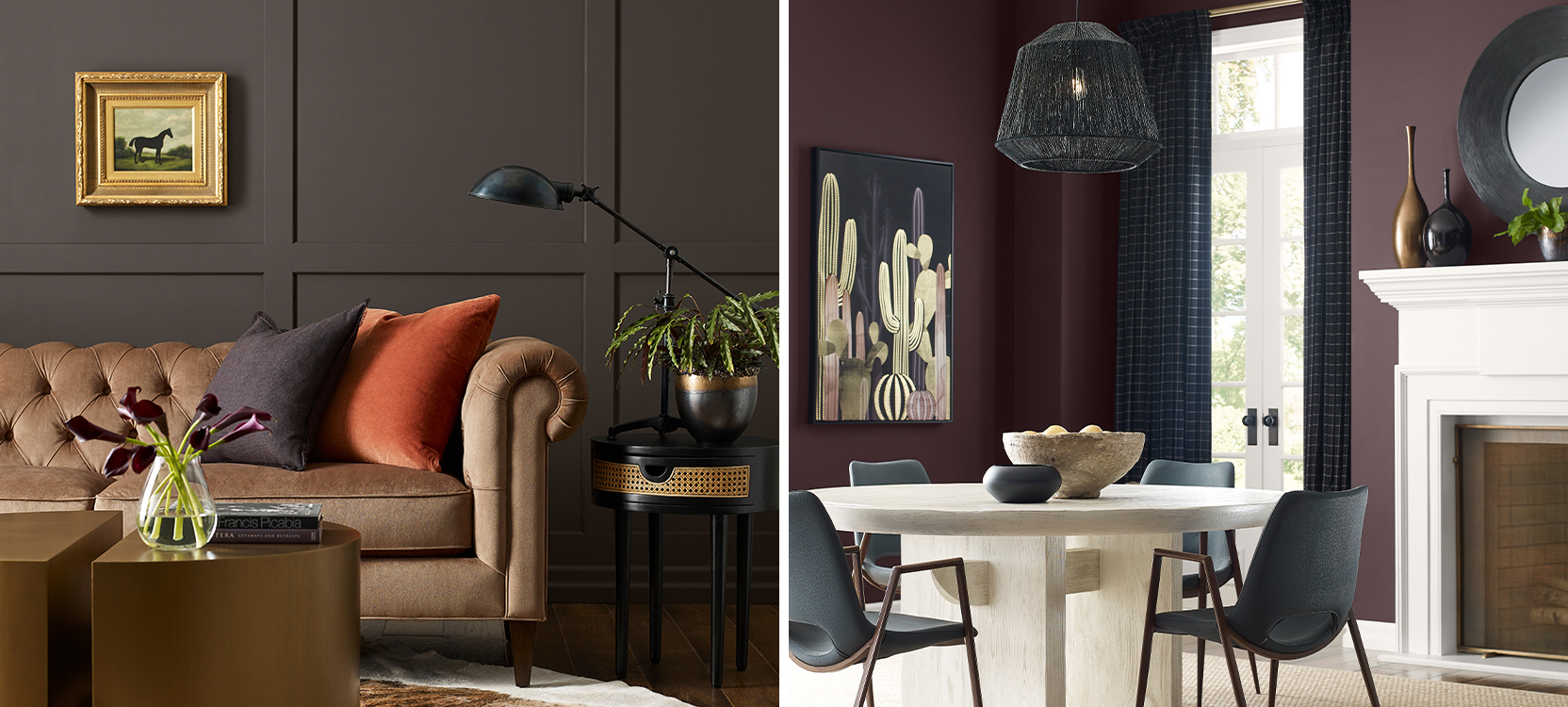
Enriching Reds, Purples, and the Rise of Browns

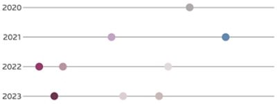
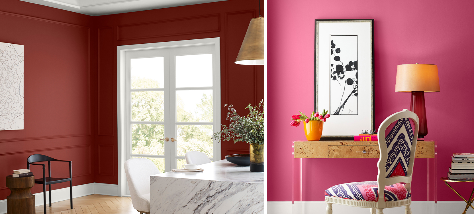
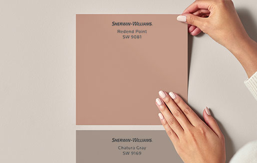
Since 2020, our forecasts have included an abundance of mineral reds ranging from deep to midtone in value, with scene-stealing and energy-boosting corals and pinks. Before now, warmer-undertone reds, cooler pinks, and magenta were emphasized. But in the current and coming years, this hue group is likely to evolve beyond these expressions, with more muted and soulful clay pigments, pink-beige neutrals, true purples, and nostalgic brights taking the lead.
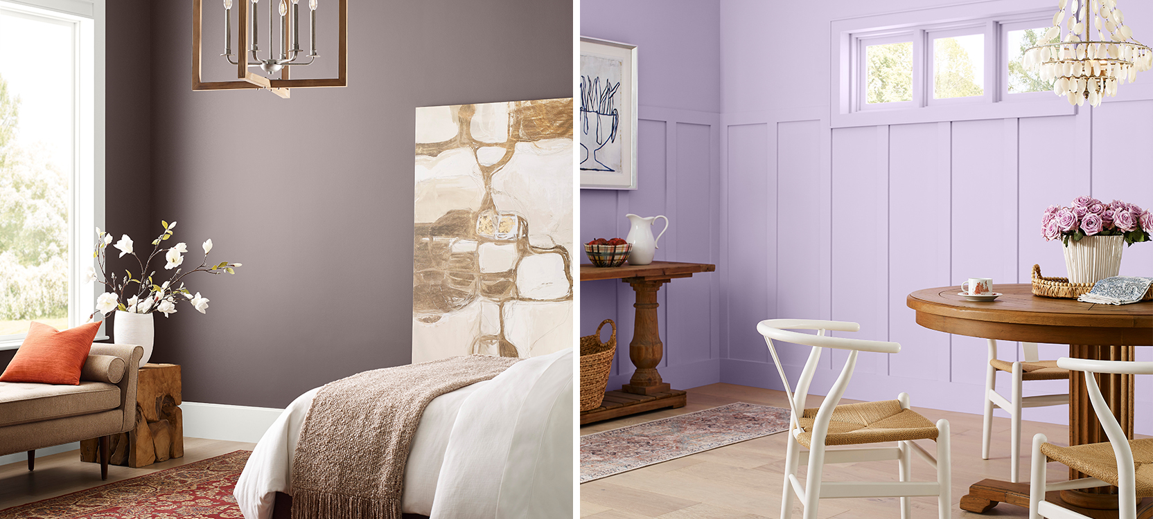
Design aesthetics have been trending toward warmer colors in recent years, coinciding with the rising popularity of earth-aligned browns—rather than the cooler, grayed-out browns from earlier in the decade—as well as a deliberate and consciously stylized mix of hues from the red and purple family to create atmospheres of groundedness and balance.
The Growing Popularity of Dark Colors

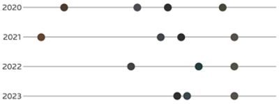
“In an era where well-being is increasingly important,” says Wadden, “dark colors can offer solace and soothe anxieties. Since 2020, deep-value tones have become synonymous with sanctuary, nurturing, and artisanal touches.” Over the past few years, rich and mysterious colors have not so much changed as they have continued to gather momentum and power in the world of design.
In response to global challenges and collective uncertainty about the future, chromatically intense colors are poised to remain an important and compelling element in design for many seasons to come. The experts on our Color Forecast team theorize that deep tones are on the rise as a result of rapid societal change, and that their ability to produce a comforting, cocooning effect will be instrumental in creating modern spaces that soothe. This value range will help to balance the increasing radiance of bright tones in 2024 and beyond.
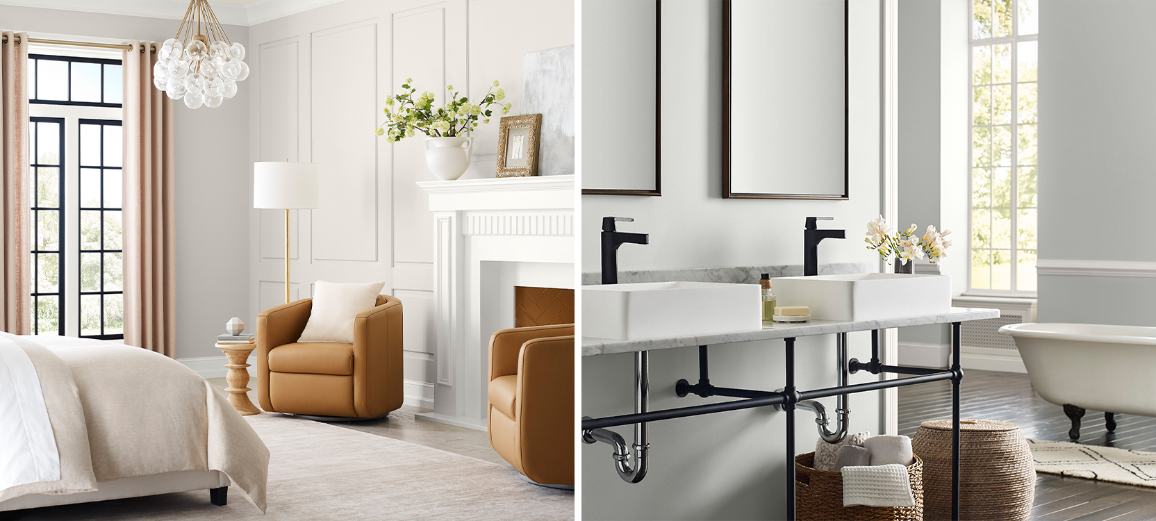
The Ongoing Evolution of Whites and Tints

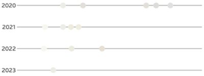
This paradigmatic color family plays a pivotal role in contemporary designs, offering a starting point for designers as they seek the perfect foundational white or near-white for their projects. Transitioning from the stark whites that were so beloved earlier in the decade, in 2024 we’ll see the emergence of more richly nuanced and affective whites and tints.
The subtle shifts in this color group signify broader acceptance of less-is-more aesthetics, offering realignment and restfulness in contrast to more chaotic color stories and stabilizing the trend toward deep, moody hues. “White is widely utilized as a clean and calming wellness color; however, moving into 2024 and 2025, it will become linked to sustainability, conservation, and slow living,” Wadden predicts. “Reduction, mindful consumption, and considered curation are fueling this fresh, restorative take on minimalism.”
By examining related colors and individual hues, we can trace the rise and fall of their popularity across decades. As we embark on a new year, we’ll delve into this color continuum to chart the present and future trajectory of colors over the next 24 months.
Bring the complete forecast to life with color samples, and order your designer-exclusive lookbook through your account executive now. Watch for live and virtual events to learn even more about the inspiration and influences behind this year’s forecast.


